Design With Pantone Color Of The Year 2022 Very Peri
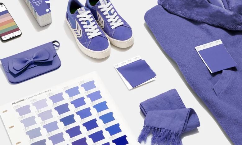
Original Blog by Pantone USA: https://www.pantone.com/color-of-the-year-2022-tools-for-designers
Tools For Designers
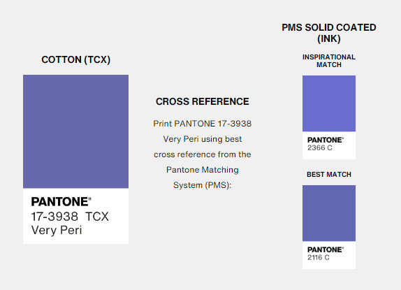
More than 10 million designers and producers around the world rely on Pantone Products and Services to help define, communicate and control color from inspiration to realization—leveraging advanced X-Rite technology to achieve color consistency across various materials and finishes for graphics, fashion, and product design. Pantone Standards feature digital and physical color specification and workflow tools. Read on to learn more about applying the Color of the Year 2022 across various industries, determine color values across our color systems, explore palettes and color harmonies, and more.
USAGE
2022 marks the first time a color has been custom created for the Pantone Color of the Year program. PANTONE 17-3938 Very Peri blends the faithfulness and constancy of blue with the energy and excitement of red to introduce an empowering mix of newness to apparel, beauty, home furnishings, product design, and packaging.
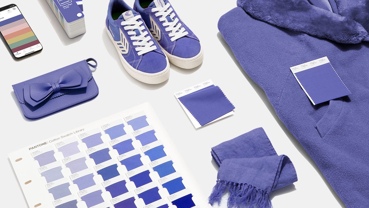
VERY PERI IN APPAREL AND FASHION ACCESSORIES
PANTONE 17-3938 Very Peri, a warm and friendly blue hue with a carefree confidence and joyful attitude, emboldens uninhibited expression and experimentation. This enthusiastic blue hue displays a dynamic presence and a whimsicality that lends itself to unpredictable color harmonies and spontaneous color statements. Futuristic in feeling, PANTONE 17-3938 Very Peri takes on distinct appearances through application to different materials, finishes, and textures, from shimmery metallics, lustrous sheens, and high-tech materials, to hand-crafted looks and natural fibers.
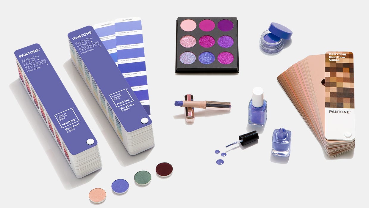
VERY PERI IN BEAUTY
Suggestive of personal inventiveness and daring imagination, PANTONE 17-3938 Very Peri makes a novel statement for eyes, nails, and especially hair when used in a variety of finishes and applications, from glittery and glam, to dusty matte.
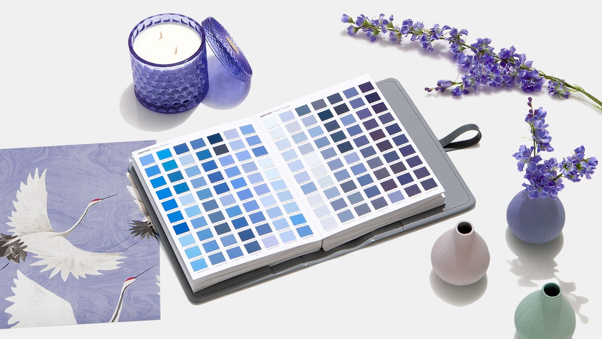
VERY PERI IN HOME DÉCOR
Evocative of a new modernity, PANTONE 17-3938 Very Peri injects a sense of playful freshness into home interiors, enlivening a space through unusual color combinations. A versatile shade that animates our creative spirit, PANTONE 17-3938 Very Peri is suited to an array of different materials, textures, and finishes, providing a pop of color whether introduced through a painted wall, statement furniture or home décor, or acting as an intriguing and eye-catching accent in a pattern.
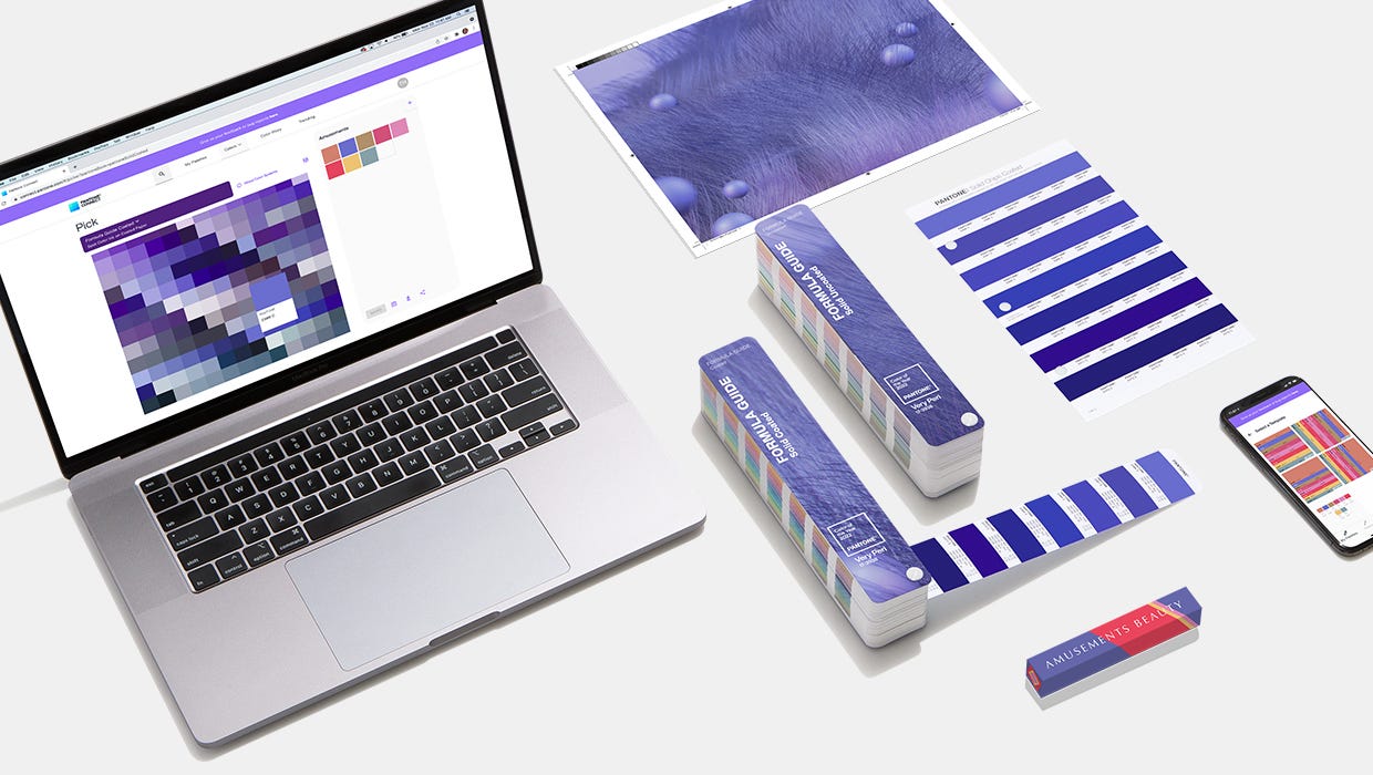
VERY PERI IN PACKAGING AND MULTI-MEDIA DESIGN
Fusing together the constancy and continuity of blue with the energy and excitement of red, PANTONE 17-3938 Very Peri conveys a message of credibility as well as creativity. Whether appearing in a fantasy digital realm or in physical materials, PANTONE 17-3938 Very Peri exudes a good-natured warmth that quickly engages the eye, making it an ideal shade for many applications of graphic and multi-media design, as well as packaging.
