A Rainbow of Color Harmonies
Consider color harmony both within your design and between your design and the garment.
Create a visually appealing design that is pleasing to the eye.
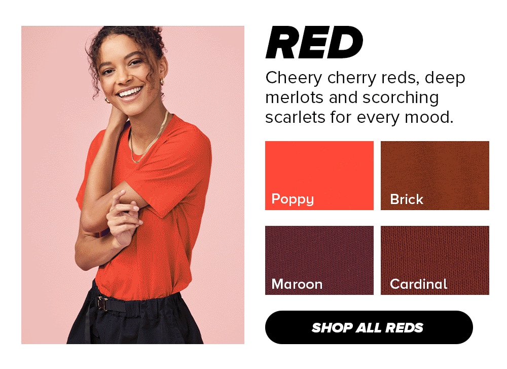
Red
Red is a bold and passionate color that represents energy, excitement, and intensity, and can add a sense of drama and vibrancy to any design.
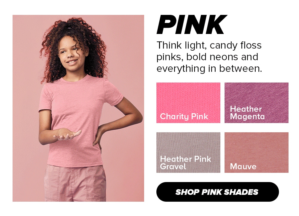
Pink
Pink is a versatile color that can evoke a range of emotions, from sweetness to playfulness and creativity, and can add a soft and charming touch to any design.
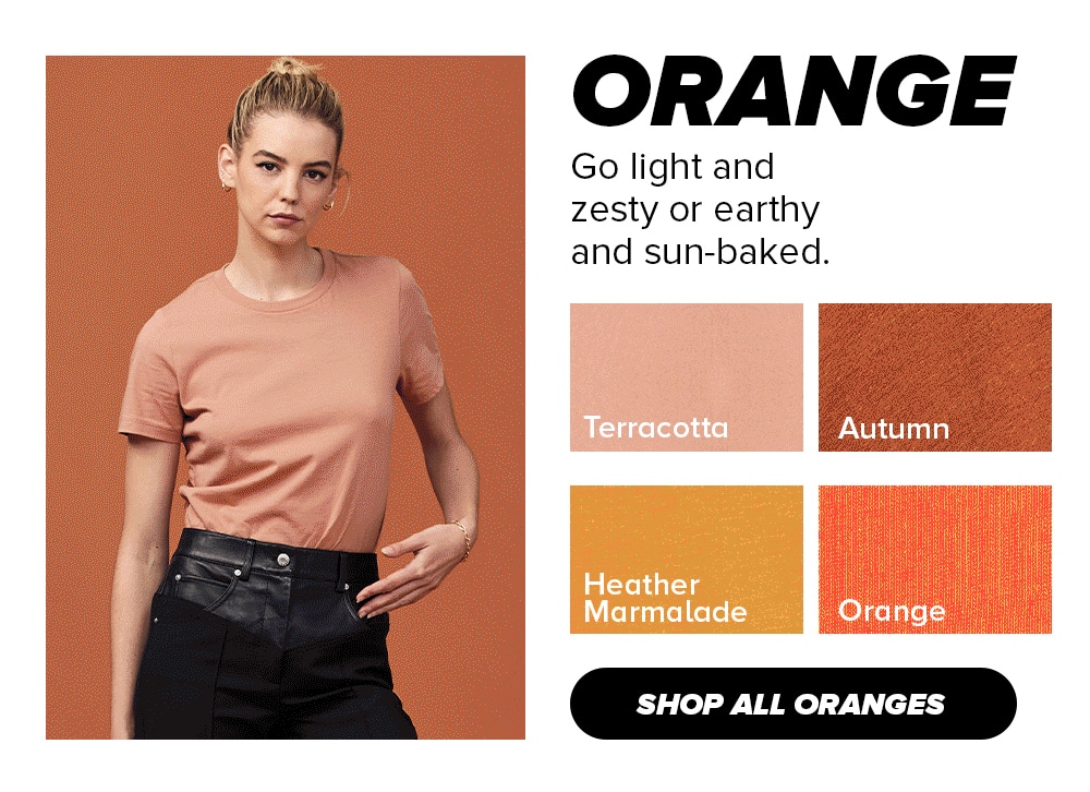
Orange
Orange is a warm and energetic color that represents enthusiasm, creativity, and happiness, and can add a bold and playful touch to any design.
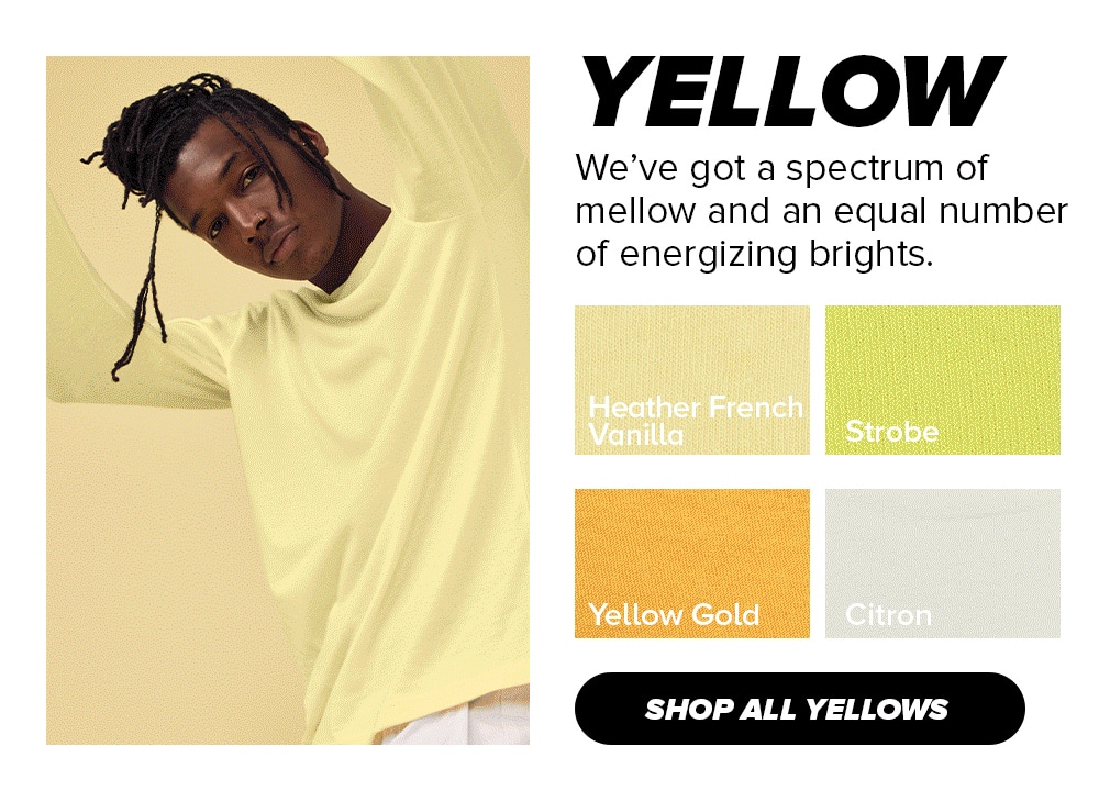
Yellow
Yellow is a cheerful and optimistic color that can bring a sense of warmth and happiness to any space.
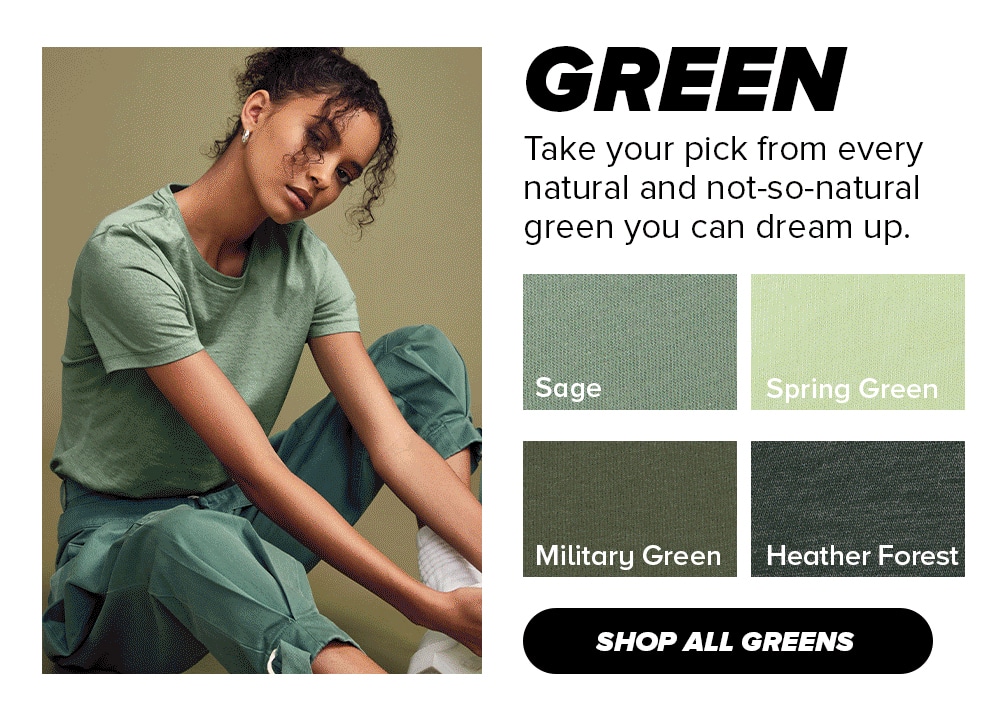
Green
Green is a refreshing and calming color that represents growth, harmony, and balance in nature and can bring a sense of tranquility and renewal to any setting.
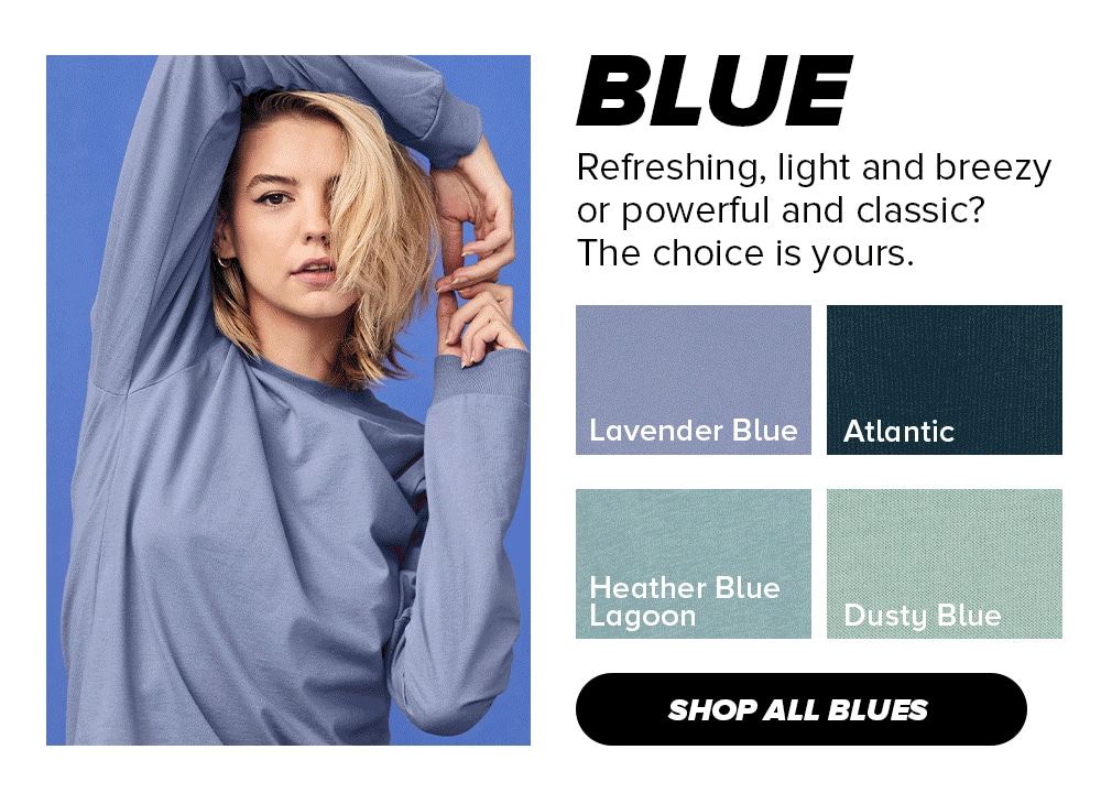
Blue
Blue is a serene and peaceful color that evokes a sense of calmness, stability, and trust, and can create a soothing atmosphere in any space.
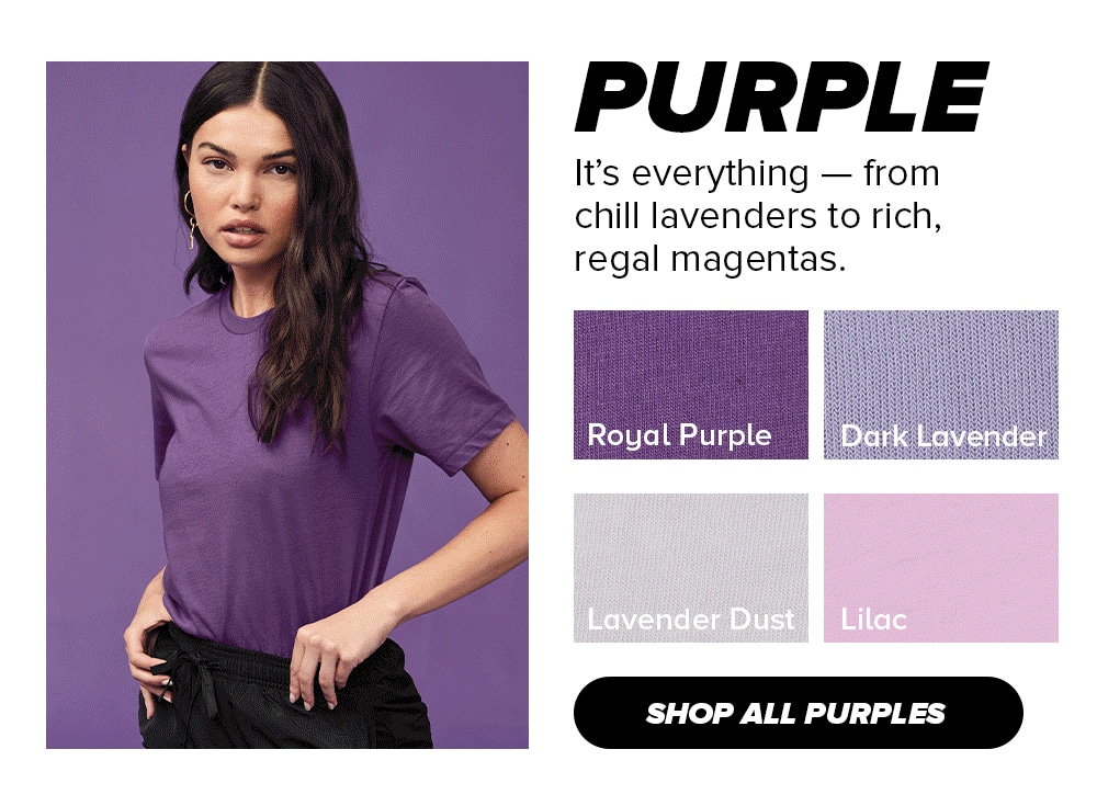
Purple
Purple is a regal and luxurious color that symbolizes creativity, spirituality, and royalty, and can add a touch of elegance and sophistication to any design.
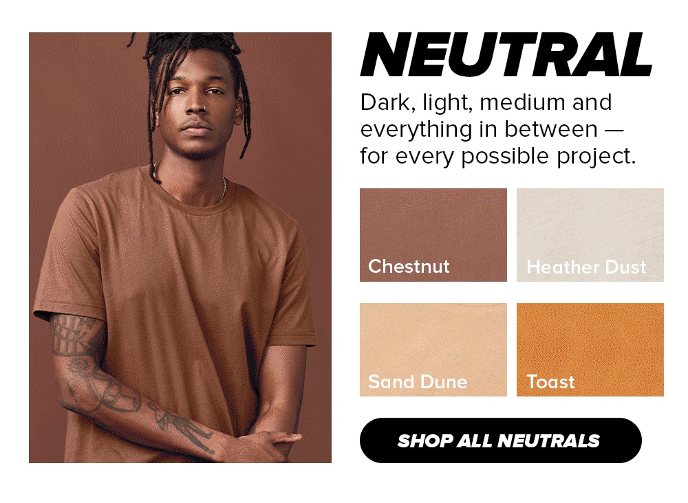
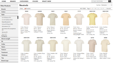
Neutral
Neutral colors are versatile and timeless, providing a sophisticated and calming backdrop that can complement any style or design aesthetic
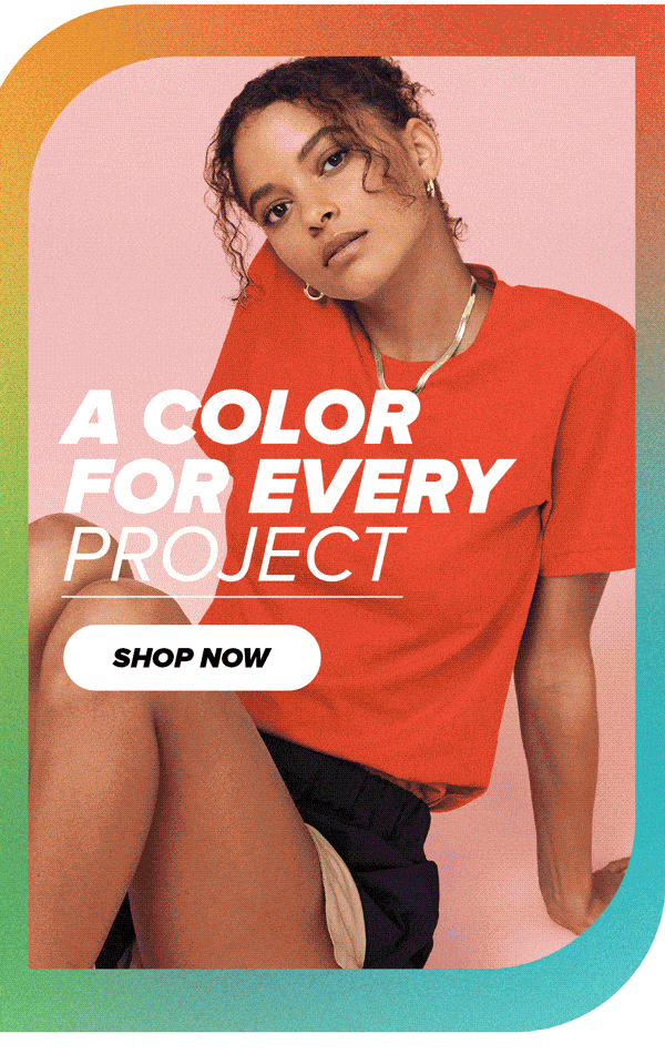
Designing t-shirts for print can be an exciting and creative process. Whether you’re designing t-shirts for your brand or a specific event, there are a few key considerations that can make your t-shirts stand out. One important factor to keep in mind is color harmony, both within your graphic design and between your design and the garment.
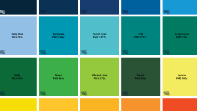
Color harmony refers to the pleasing arrangement of colors in a design. When selecting colors for your graphic, consider the color wheel and color theory. The color wheel is a visual representation of how colors relate to each other. It’s made up of primary colors (red, blue, and yellow), secondary colors (green, orange, and purple), and tertiary colors (yellow-green, blue-green, red-orange, etc.).
When choosing colors for your design, consider color harmony. There are several types of color harmonies that can be used in graphic design, including complementary colors (opposite colors on the color wheel), analogous colors (colors that are adjacent on the color wheel), and triadic colors (three colors that are equidistant from each other on the color wheel). By using color harmonies, you can create a visually appealing design that is pleasing to the eye.
It’s also important to consider the color of the garment you’ll be printing on. The color of the garment can affect how your design looks and how the colors appear. For example, if you’re printing on a dark-colored shirt, you may need to use lighter colors in your design to ensure that the colors are visible. Alternatively, if you’re printing on a light-colored shirt, you may need to use darker colors to create contrast.
When designing for a specific garment color, it’s important to consider color contrast. Contrast is the difference between two colors and can be used to make your design stand out. For example, if you’re printing on a black shirt, you may want to use white or bright colors in your design to create contrast.
Another consideration when designing t-shirts for print is the type of printing method you’ll be using. Different printing methods can affect the colors in your design and how they appear on the garment. Screen printing, for example, can produce vibrant colors, but may not be suitable for complex designs with a lot of color variations. Digital printing, on the other hand, can produce complex designs with many colors, but may not be as vibrant as screen printing.
When designing t-shirts for print, it’s important to consider color harmony both within your design and between your design and the garment. By using color theory and color harmonies, you can create a visually appealing design that is pleasing to the eye. Additionally, by considering the color of the garment and the printing method you’ll be using, you can ensure that your design looks great on the final product.